You just created a graph or chart in Excel but you don’t like how it looks? Learn how to easily format charts in Excel and how to modify elements such as chart labels or legend.
Excel charts help you maximise the impact on your audience (customers, manager, teachers) while presenting data. It’s easier to understand the relationship between different elements. You can also highlight visually some trends like an increase in sales or how you helped your customers reducing their CPA.
Are you ready to learn how to style Excel charts?
Basic elements of an Excel chart
An Excel chart contains some basic elements, such as a title, a legend or chart labels. You can change chart labels in Excel, or format other chart elements, the way you like.
First, let recap where you could find these basic elements… in an Excel chart.
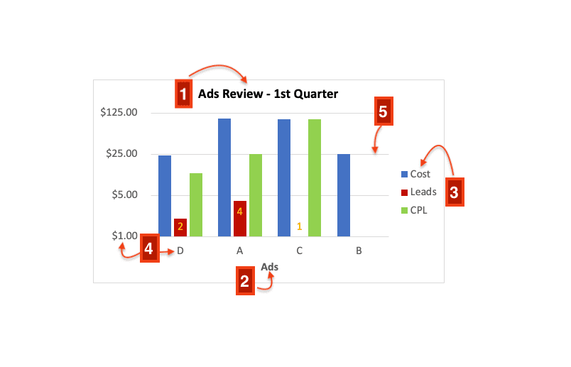
- Graph title
- Axis title
- Legend
- Axis labels
- Gridlines
Charts design in Excel
Find out how to format charts in Excel with this free tutorial: change chart labels, graph title, remove gridlines and customise legends.
Where is the Chart Design tab?
Click your chart for the Chart Design tab to appear in Excel.
How to change chart labels in Excel
Modify the text or style of your chart labels easily to impress your audience; change axis labels text or add data labels to highlight important numbers.
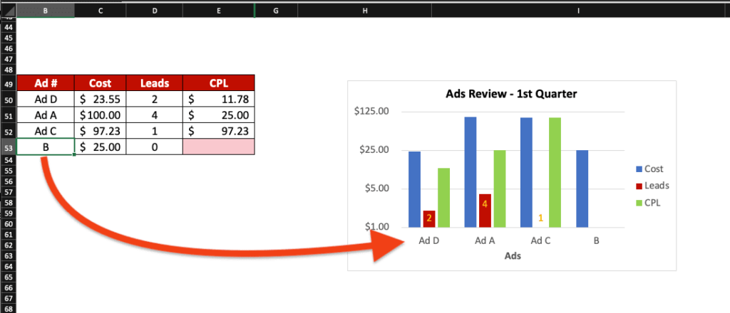
Change the text of the labels

Change the text of axis labels in Excel by typing the text you want in each cell containing the data of your graph.
For example, if you want to modify the labels A, B, C and D to Ad A, Ad B, Ad C and Ad D, change the text directly in column B. The system will update automatically the labels in your graph.
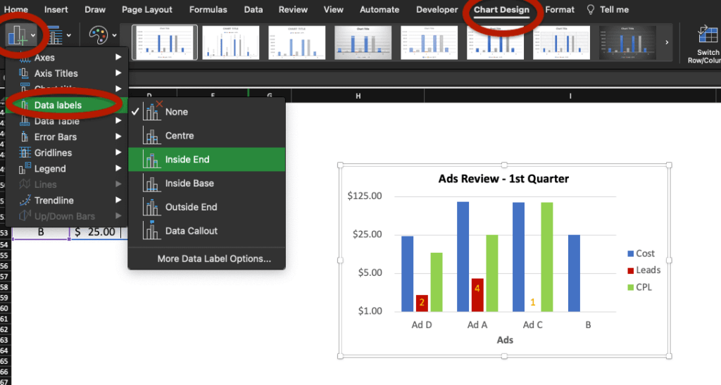
How to add data labels in Excel charts
Enable data labels by selecting Chart Design, Add Chart Element then go to Data Labels and select the style you like.
If you wish to add labels for some but not all data, select the data in your Excel chart first: the system will then add data labels only for the data you selected.
You can also change the position of each data label, individually, by clicking on it.
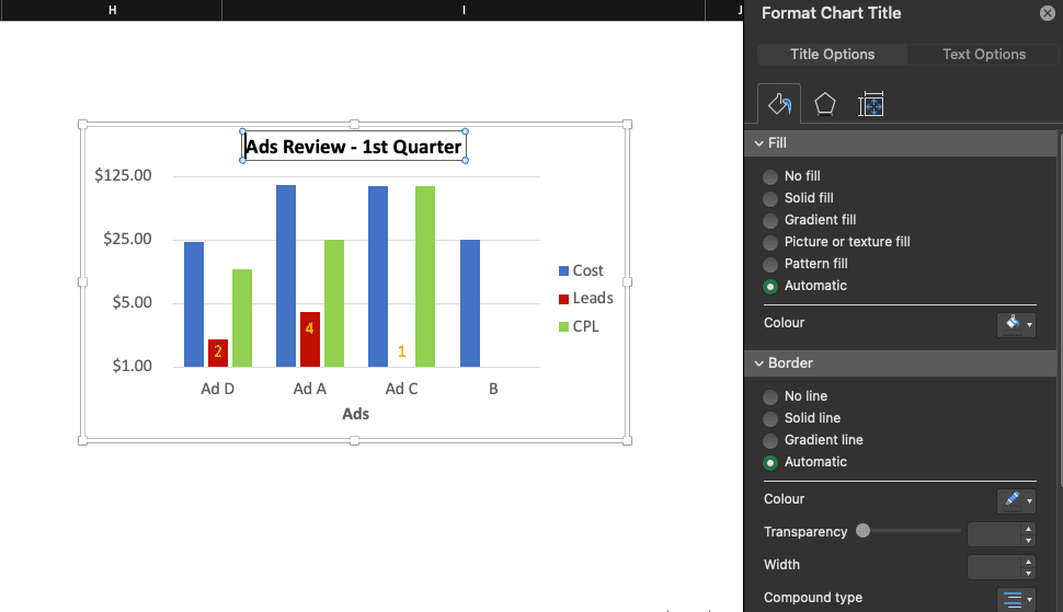
How to style a chart title

To style a chart title in Excel, select it with a left click to change the text or modify the formatting in the Format Chart Title tool. Shortcuts like Command + B (bold) work too!
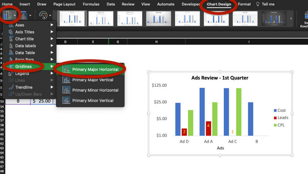
Remove gridlines on Excel charts
To remove gridlines on your Excel chart, go to Chart Design then Add Chart Element. Select Gridlines and disable gridlines by unticking the selected option.
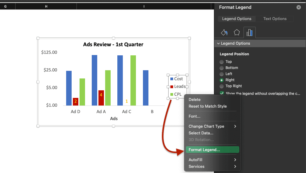
How to move Excel charts legend
To move the legend of your chart in Excel, right-click the legend and select Format Legend… for the options to appear or double click the legend in your graph.
What’s the shortcut to create graphs in Excel?
On Mac, there is no shortcut to create a graph or a chart automatically but you can create some Charts shortcuts yourself by going to Tools, Customise Keyboard and by selecting Chart Tools in Categories. You will then have plenty of commands to choose from.
If you don’t know how to create shortcuts in Excel, check this tutorial.
Now, you know how to format charts and graphs in Excel: how to change the legend position, how to change chart labels, how to remove gridlines, etc.
Learn more Excel tips and tricks with Ted Jordan by joining our Excel Online Course now. Master MS Excel at your own pace and get certified at the end of the course. Join the Course now!