Did you outperform during the last months and want to highlight it? Maybe your client sold more products than expected thanks to you? Or you exceeded your targets?
Impress your boss with your Excel skills and showcase your great results with unique bar charts. Learn how to combine sales and forecast data in the same bar chart and how to custom it.
Continue to read to learn how to create bar charts in Excel.
Ready to learn?
How to create an Excel bar chart?
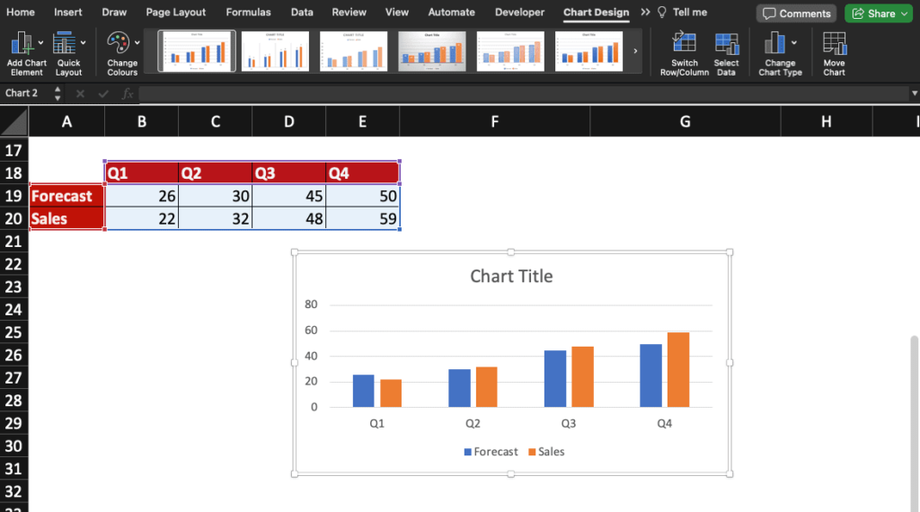
First, let start by creating a bar chart to showcase actual vs targets in Excel.
Select your table then go to Insert and click the Column icon to create a bar chart. In this example, let choose the first 2D clustered column chart.


You now have a bar chart created by the system that looks like this.
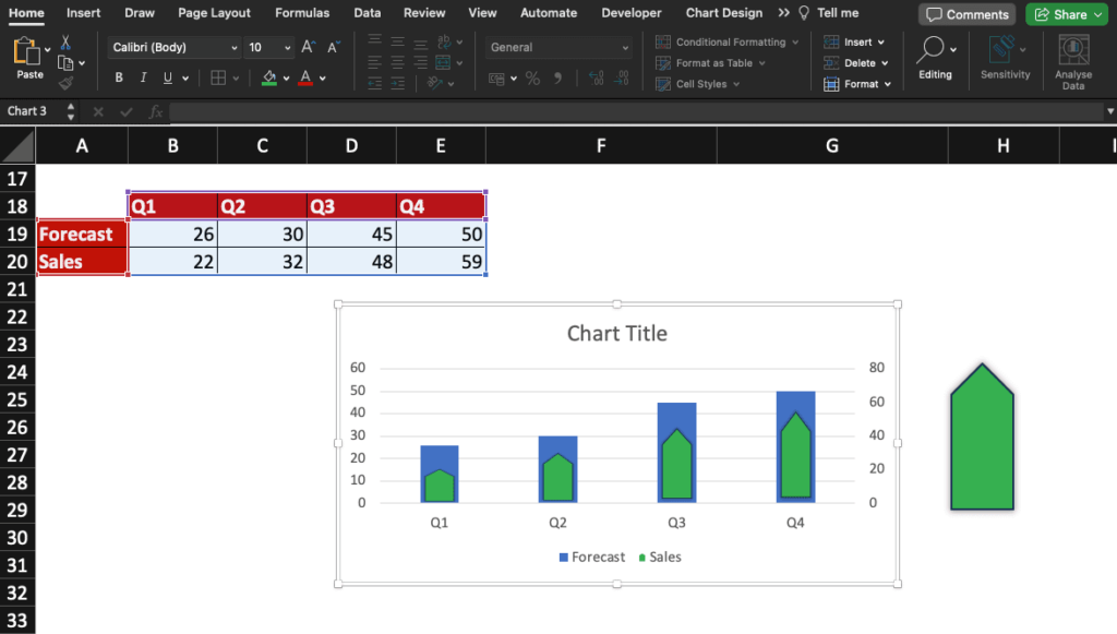
Time to add a secondary axis to combine sales and forecast data in an efficient format!
Adding a secondary axis helps you selecting more easily elements in the chart.
Add secondary axis and customise it
Add a secondary axis in your chart by double-clicking a Sales bar: the Format Data Series window will appear.
Then select Secondary Axis and change the Gap Width for the Sales bars to be slightly thinner than the Forecast ones.
Now that you have inserted a bar chart and have added a custom secondary axis, let customise the bar shape and finish customising our graph.
How to use custom shape in Excel charts?

Customising charts can make your data easier to read and may impress your audience.
Choose the shape you want to use to make your data stand out then format it if needed. Change its colour, add shadow, etc.
If you don’t know how to change shapes in Excel column charts, click here to access our tutorial.
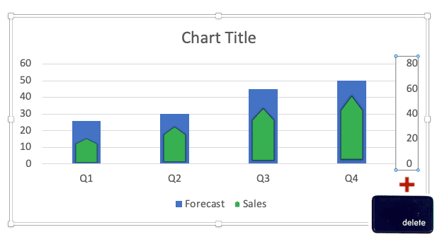
Remove axis in bar chart: combine sales and forecast data
You created an Excel bar chart, added a secondary axis, customised the columns with a shape of your choice: you are ready for the next and final steps!
Now, let remove one of the axis to combine sales and forecast data in your chart.
To do so, click the axis you wish to delete ad press the delete key on your keyboard.
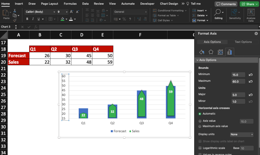
You may need to readjust the axis values like in this example. Indeed, some values in Sales and in Forecast are close and it’s difficult to differentiate them.
To do so, double-click the axis to open the Format Axis window.
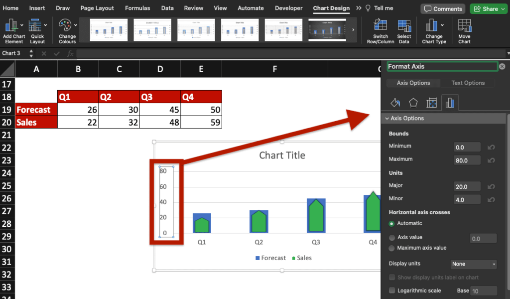
Modify the axis bounds and units, delete the chart title (select it then press the delete key) and add the Sales values on the chart for clarity.
Check this Excel bar chart with sales and forecast data combined!
Now, you know how to create a bar chart in Excel and how to customise it in order to combine sales and forecast data like a pro.
Ready to take a step further? Join our Dashboard Course for $0 (limited offer)!