How to change shapes in Excel column charts

Learn how to easily change the columns shape in your Excel charts so your colleagues and customers will remember your impacting graphs.

Tired of using the same basic rectangular shapes in your Excel column charts? Do you want your customers to remember your presentation? Customise your charts with impacting shapes!

Say goodbye to boring basic shapes and create beautiful charts with these tips.
Discover now how to change shapes in Excel.

Customising your charts can make the data easier to read, give additional information or have a stronger impact on your audience.

In Excel, you can modify colours, styles, borders, create a 3D effect and much more. Using specific shapes will enhance your infographic, if done correctly.

In Microsoft Excel, you can personalise your infographics at various levels and in different ways. Today we focus our interest in modifying the shape of column charts.

>> Did you know you can create a shape in Excel and paste it in your chart to modify its columns?

– Make sure the shape you are using will fit as columns; you want size and format to look good in your MS Excel graph.

Creating custom columns in Excel – Shape

Once your chart is created, follow these 3 steps to change the shape of your bar chart:

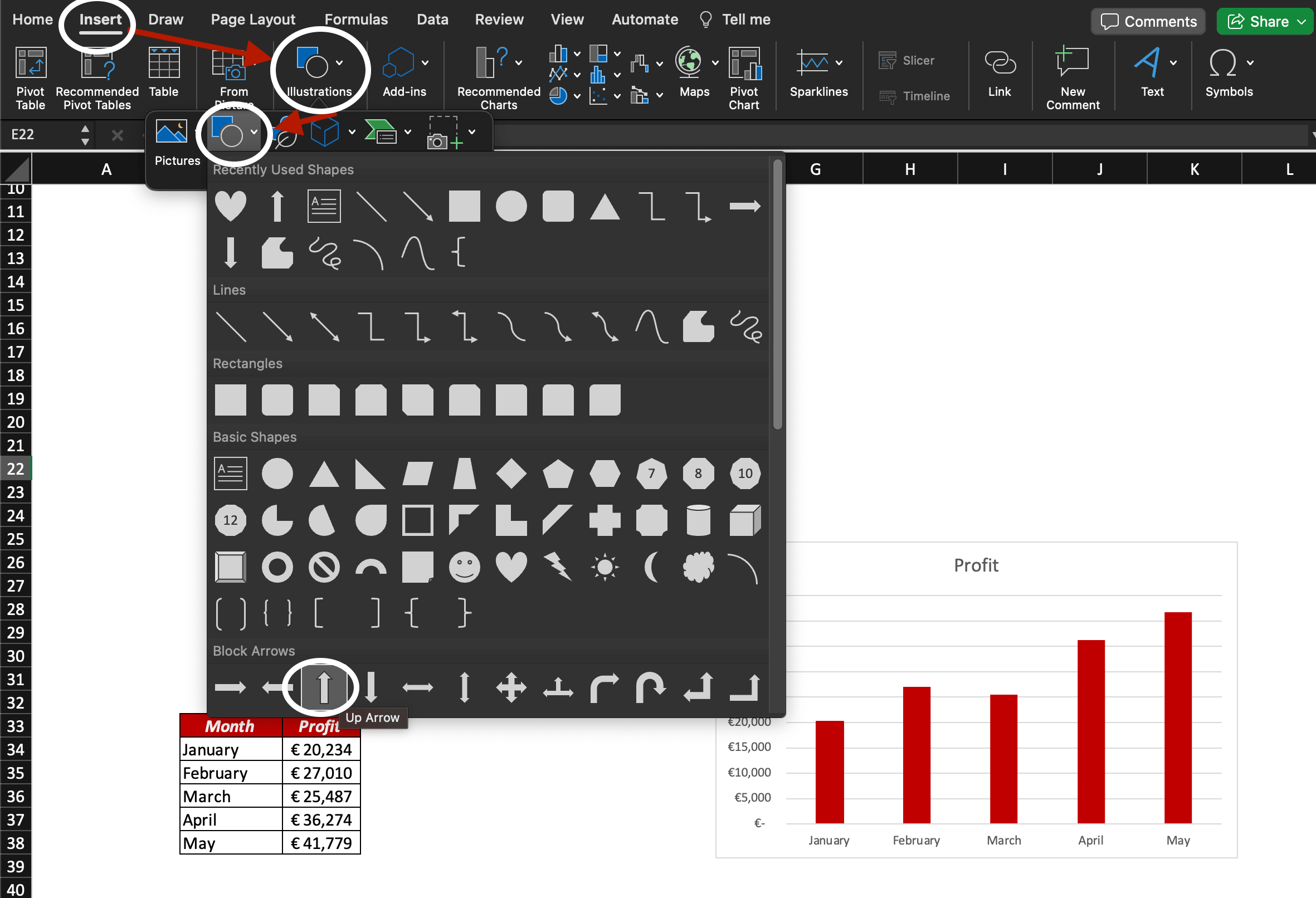
– Click on Insert>Illustrations>Shapes and select the shape you want to use in your chart.
In this example, we want to use the arrow pointing up to showcase the profit increase through the mentioned months.

– Draw the shape you want to use.

– Select the shape you just drew then press Command+C (copy).
– Click on one of your chart columns then press Command+V (paste).


Now you changed the columns shape of your Excel chart!

For more customisation options, double click on one of the columns.

Creating custom columns in Excel – Icon

If you want to use icons in order to modify the columns shape of your chart, follow these steps:

– Once you have created your chart, click on Insert>Illustrations>Icons: the Stock Images window will appear.

– Search for a suitable icon to use, select it and click Insert.

– Once inserted in your worksheet, select the icon and press Command+C (copy).
– Click on one of the columns in your chart and press Command+V (paste). Now the columns are represented by an icon (a human shape in our example).

What are the shapes you will use in the future, now that you know how to change columns shapes in Excel? Feel free to insert drop-downs and slicers in your presentations too.

Discover more tips about Data Visualisation in Excel by joining our online Course!

Advertising
Analytics

Categories

AllAdvertisingFormatsPlatformsKPI'sAd News
What is Programmatic Advertising?

What is Programmatic Advertising?

Understand what programmatic advertising is and how it works to increase your ROI and become a programmatic specialist.

Read More
Programmatic Advertising: What is a DSP?

What are DSPs?

A DSP is a great tool to use but what does DSP stand for in marketing? What are some Demand-Side Platforms examples? Today, we answer your questions!

Read More

Best DSPs for Programmatic Advertising

Ted Jordan shares his list of best DSPs for Programmatic Advertising so you don’t have to lose time searching the internet to find the right Demand-Side Platform for your campaigns.

Read More
Programmatic Advertising: What is a SSP?

Supply-Side Platforms (SSPs) Explained

SSPs basics in advertising: learn what Supply-Side Platforms are used for and who use them. Get familiar with more programmatic advertising technical terms.

Read More

What is O&O Advertising?

Discover one more important jargon term used in Programmatic Advertising: O&O advertising. Get familiar with O&O formats and advantages.

Read More
Programmatic: Pixels in Advertising 101

Advertising pixels: types, pros and best practices

Learn the basics of Programmatic Advertising with Ted Jordan! Today, we explain what a pixel is in advertising with simple words and expertise. Ready to learn?

Read More

Categories

AllFunctionsToolsShortcut Keys

How to change shapes in Excel column charts

Learn how to easily change the columns shape in your Excel charts so your colleagues and customers will remember your impacting graphs.

Read More

How to use the LEFT, RIGHT and MID functions

Learn how to extract text in Excel with the LEFT, RIGHT and MID functions. Plenty of examples to learn from and functions are explained with simple words. If you start...

Read More

Excel IF statement: how to use it for 3 conditions

Learn how to use the Excel IF statement with multiple conditions and combine it with OR and/or AND functions!

Read More
Navigating with Tab, Enter, and Shift Key on Excel.

How to move between cells when arrow keys are not working (Excel)

Learn how to move between Excel cells without using your mouse or arrow keys. Discover more shortcuts and tricks below!

Read More

How to use the IFERROR function (Excel + Google Sheets)

Discover how to use IFERROR in Excel or in Google Sheets in 4 easy steps! No more errors on your documents or dashboards with IFERROR.

Read More
Split Semicolon Separated Value in Excel

How to split semicolon separated values in Excel

Split semicolon separated values in Excel into columns and rows, or convert columns to semicolon separated values, like an Excel Master!

Read More